The Ink That Writes Better Than It Looks: Why Rohrer & Klingner Morinda Deserves Your Spring Rotation

It started with a Pelikan 400NN I'd pulled from an estate lot — brown-striped, slightly crazed on one barrel section, with a completely seized fine nib that had been sitting dry for at least a decade. The usual story. I cleaned it out, straightened a small tine misalignment under the loupe, and needed something to cycle through it for the post-restoration flush-and-test phase.
I didn't want to run blue. I'd been elbows-deep in Waterman Serenity Blue for two weeks — it's my go-to flush ink, well-behaved, cheap enough that I don't cringe when I run it through problem nibs — and I needed a palate cleanser. On the shelf above my bench I spotted a 50ml bottle I'd picked up at the Vienna Pen Meeting three years ago on a whim: Rohrer & Klingner Morinda.
Dusty mauve. German label. A brand founded in Leipzig in 1892, still operating, and rarely discussed in the English-language corners of this hobby where I spend my time. I'd cracked it open once, written two lines on a scrap of Rhodia, and put it down. That was the sum total of my acquaintance with this ink.
This time I loaded it into the 400NN, ran a line across 52gsm Tomoe River, and heard that sound. That scritch-scratch — the specific resistance-and-release that tells you a nib is well-seated and the ink is doing exactly what ink is supposed to do. I stopped. Looked at the line.
Then I spent the next forty minutes writing nothing useful.
What the Ink Actually Does
Let me be straight with you: Morinda is not a dramatic ink. If you're chasing the sheen monsters — the inks that leave a red shimmer on top of green ink, the ones that photograph like oil slicks — this is not your bottle. Put it down and go back to Diamine Autumn Oak.
What Morinda does is shade. And it shades in a way that took me genuinely by surprise.
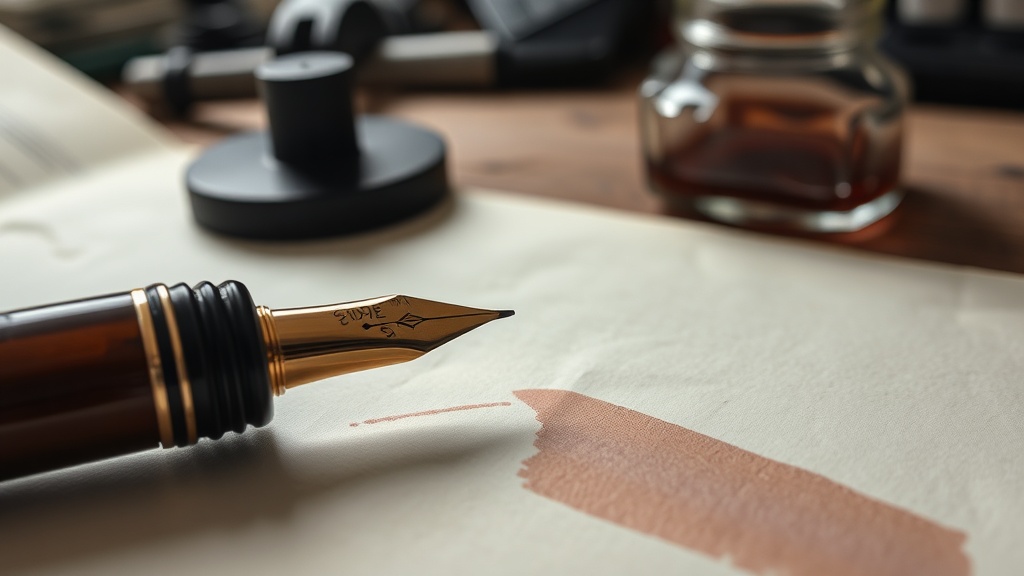
The base color is a muted dusty mauve — not purple, not pink, not grey, though it contains suggestions of all three. On white paper under cool light it reads almost like a faded terracotta. On cream paper it leans warmer, closer to a dried rose petal. The variation within a single stroke, on a flexible or even a standard semi-flex nib, is substantial: the thin upstrokes come out nearly grey-lavender, and the downstroke swells bloom into a warm, saturated mauve. The tonal range between those two extremes is wider than I expected from an ink this quiet in the bottle.
On 52gsm Tomoe River — my paper of choice, increasingly hard to source, and worth treating like the precision instrument it is — Morinda behaves impeccably. Zero feathering. No bleed-through, even on a broader nib. Dry time is moderate, maybe 12–15 seconds on a fine, longer on a stub or broad, which is worth knowing if you're a lefty or a fast writer. But the real story is what happens as it dries: the shading sets with more contrast than it shows wet. What looks like a modest tonal variation in the wet line reveals itself as a genuinely expressive range once the page dries. I've seen inks do the opposite — show off wet, flatten dry. Morinda ages well.
Water resistance is modest. This is not an iron gall ink; I've written that piece already, and Morinda lives in a different register. A single water drop left a partial ghost and some pigment migration, which is honest behavior for a dye-based ink with no added permanence. If you need waterproofness for archival work, use iron gall and accept the trade-offs. Morinda is for correspondence, journaling, daily writing — the practice, not the archive.
Flow from the 400NN's fine nib was controlled without being dry. It's a medium-wet ink that gave me a consistent line without flooding, which matters for a restored pen where you've already done the work of optimizing the gap and the channel. When an ink floods slightly thready nibs, you lose your calibration data. Morinda behaved, which let me trust what I was reading about the pen's performance.
Why Nobody In My Circle Is Talking About This
Rohrer & Klingner has been making ink since 1892. They are not a garage operation. They make a drawing ink, a writing ink, several iron gall formulations, and a full line of bottled fountain pen inks. Their Dokumentus series includes DIN-certified document inks at accessible prices. They're not obscure in the sense of being small — they're obscure to me in the sense of being German-market-primary.
Their core market is Germany and Central Europe. Distribution into English-language specialty retailers has been inconsistent in my experience — I've found them at some online shops, absent from others, and rarely stocked in brick-and-mortar stores outside of Europe. Whether that's shifted recently I genuinely can't say; my sourcing data is my own purchasing history, not a market survey. What I can say is that their bottle design is functional and unlovely — a squat, utilitarian container that communicates nothing about the quality inside.
In a market where much of an ink's perceived value is shaped by the photograph, by the bottle aesthetic, by how the swatch renders on screen, that's a structural disadvantage. It looks like a workbench bottle. It doesn't photograph as well as a sheen-monster from Ferris Wheel Press or a Pilot Iroshizuku in one of those gorgeous square glass bottles.
What it does is write.
This is a pattern I keep noticing from the bench, though I'll put it plainly as my own opinion: the inks I reach for when I want to document a pen's performance — rather than the ink's — tend to be the quieter ones. The sheen monsters need thick paper and slow nibs to show their full effect. The shimmer inks need settling time and the right lighting angle. High-drama inks, in my experience, are optimized for documenting themselves, not for the page that only you see.
Morinda is for the page that only you see.
Honest Comparison to the Competition
These are personal comparisons from my own bench testing — your nib, your paper, your results.
Against Diamine Lilac: In my testing on 52gsm, Lilac reads pinker and more saturated in the bottle, produces less shading variation, and dries faster. It's an easier ink — more predictable, less interesting. If you want pink-purple and aren't interested in working the shading, Diamine Lilac is lower maintenance. Morinda rewards attention.
Against LAMY Violet: LAMY Violet is flat, in my opinion. Good flow, reliable, boring. It's the ink equivalent of a ballpoint — nothing wrong with it, nothing remarkable about it. Morinda has more character in the first inch of a test line.
Against Pilot Iroshizuku Murasaki-shikibu: This is the fair competition, and I'll be honest — Murasaki-shikibu is a better ink in certain respects. The shading is equally pronounced, the color is slightly more refined and consistent, and the bottle is considerably more pleasant to own. At the prices I've seen as of early 2026, it runs more than twice as much per milliliter. For the performance gap at that price difference, Morinda wins on value if you're willing to accept the utilitarian packaging.
Against Organics Studio Nitrogen: Different color register entirely — Nitrogen runs more blue-purple, less mauve. Not a direct comparison.
The Spring Angle
Early March is ink rotation season. Before the pen shows kick up and new-release noise drowns everything out, there's a window to re-evaluate what's actually in your current pens. Not what you bought last autumn because the swatch looked good on a review channel. Not what the community is hyperventilating about. What actually writes.
I went back through six months of bench test notebooks this week. The pages where I'd inked with Morinda — pages I hadn't specifically labeled, pages I'd written on without thinking — look better than I remembered. The shading is there. The line is clean. And the color sits in a register that works against fresh white paper in early spring light: warm enough to read as intentional, muted enough to not shout.
Spring is also when the secondhand market gets active before the major pen shows. Estate lots surface. Dealers clear old stock. I found Morinda at a Vienna show three years ago from a dealer clearing a backlog of European ink. You'll find R&K at European pen shows, at a handful of specialist importers, and occasionally in the back catalogs of larger pen retailers. As of early 2026, I've seen it priced around €8–12 for 50ml depending on the retailer and where you're shipping from — worth confirming current pricing before you order. That 50ml bottle will last a year of regular rotation use.
The Verdict
The mainstream — or at least the corner of it I pay attention to — hasn't found this ink. Too busy buying things that photograph well.
Their loss. Your opportunity.
The 400NN I tested it in is sitting on the repair shelf now — I kept it inked through a second week of observation. The nib hasn't complained once about the ink's behavior. Neither have I.
Load it into a medium or stub when you want the writing to reward the second look. Spring is exactly the right time for an ink this quiet and this good.
Tested on: Pelikan 400NN (restored, F nib) · Tomoe River 52gsm · Rhodia No. 16 · Leuchtturm1917 80gsm for feathering check
Happy hunting, but watch the caps.
Current Inking:
- Pen: Pelikan 400NN (restored, F nib)
- Ink: Rohrer & Klingner Morinda
- Paper: Tomoe River 52gsm, old stock